Discovery
As with all of our projects, we started the project with a discovery process aimed at finding out what defines Waves as a brand. By visiting a few of their locations, looking at reviews online, and gathering as much information as possible from its website, we believed we had a solid understanding of the brand’s personality.
To us, the Waves brand could be defined as: Friendly, Professional, Sociable, Community-minded, Satisfying.
We also established three customer profiles: Jamie, an outgoing college student who frequented Waves with friends; Jennifer, a busy professional who always visited for quick bites en route to the office; and Sharon, a successful businesswoman who regularly used Waves as a meeting point for her clients.
Visual Identity
To capture the brand's essence visually, we put together a stylescape using carefully selected photos and online visuals.
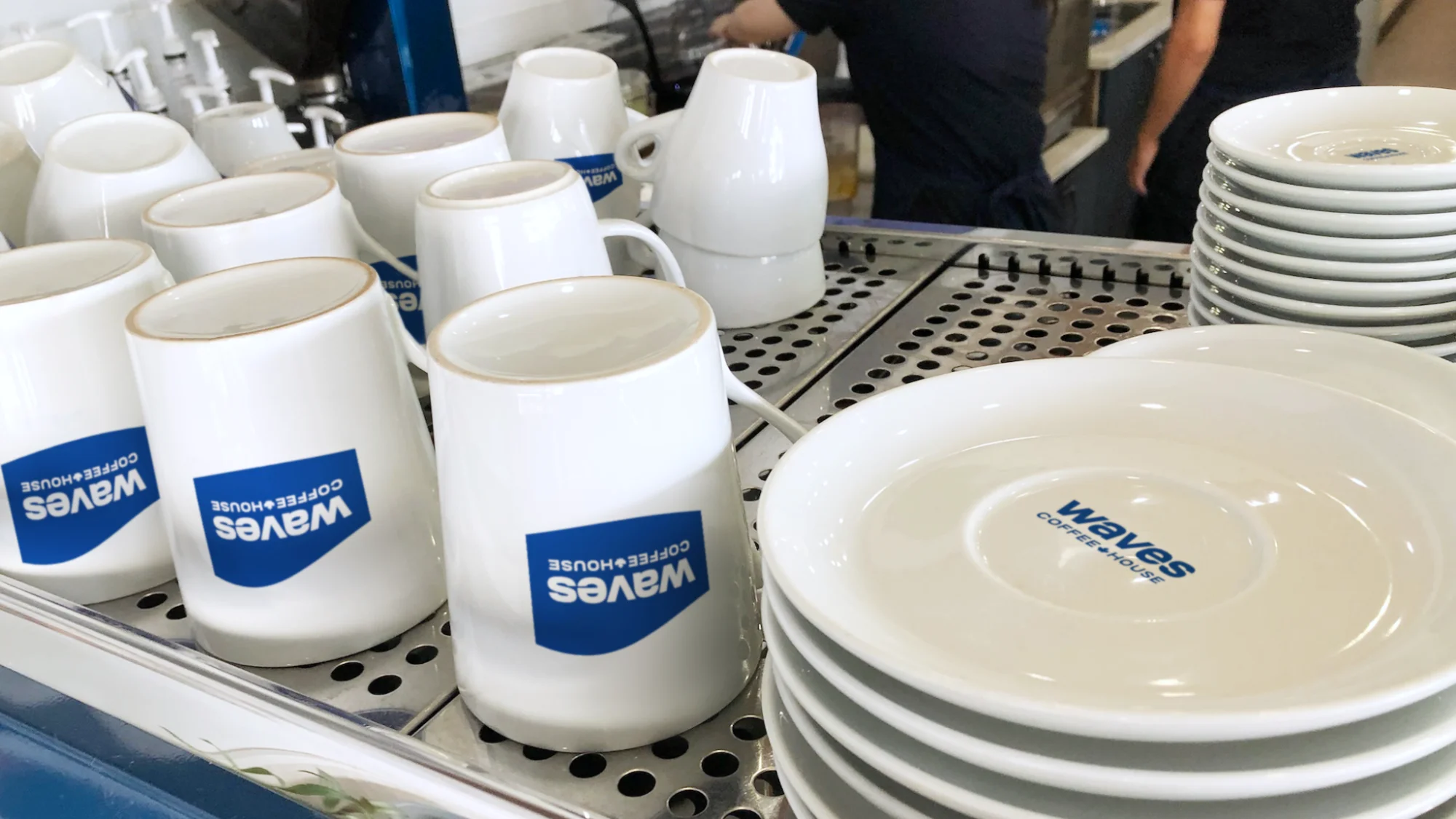
We aimed to craft a fresh visual identity that retained a sense of familiarity, so we preserved the beloved white and blue colour scheme for those who adored Waves’ current appearance.
The logo was then created within a few rounds of experiments. We let go of the circular background in favour of a more fluid shape and updated the typeface from Helvetica, which appeared timid in this case, to the more rounded and friendly Ruberoid. The blue colour was also made more vibrant and contemporary.


A New Voice
Aside from serving great coffee, Waves had long called itself a place for people to connect, and its name “Waves” came from the gesture of people greeting each other. We loved the way it had positioned itself against competitors and believed this attitude could go one step further — moving from focusing on connection to focusing on the waves of impact people make when they meet and collaborate.
The new direction placed customers at the forefront, positioning Waves as an empowering force for them to do amazing things.