Visual Identity
How do you create an identity that can coexist with so many artist brands without overshadowing them?
Our answer: by making it flexible and modular, creating a system that can deliver not just one look, but multiple looks that can be adapted to different use cases.
The logo was revamped by simplifying the multiple components of the original. We unified the typefaces, redrew the branch, and developed alternative versions to cover spaces at different sizes and on different media.
Colours and Shapes
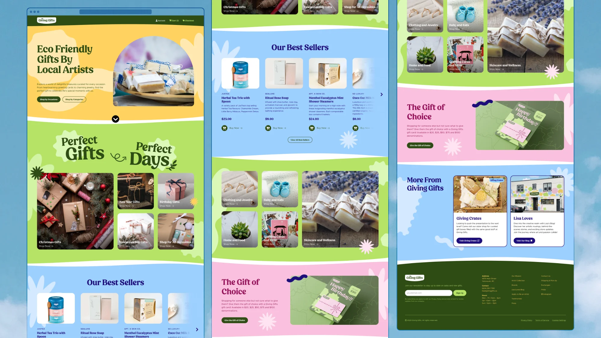
We mapped a range of colours on two axes: cold vs. warm, and light vs. dark.
The rule was simple. Any two colours could be paired as long as they were chosen from different levels of brightness, either light or dark.
This allowed colours to be paired across the warmth spectrum, creating a wide variety of combinations while remaining true to the brand.
To add dimension to the canvas and populate the background, we developed a series of shapes inspired by gifts associated with the store, such as plants, soaps, ribbons, and more.


The shapes are randomly positioned in the background, going upward from the bottom edge and mimicking gifts piling up in a gift bag.

The result was a colourful visual system that would call for customers’ attention when on full display, while retaining the ability to blend into the background when necessary, allowing branding from local artists to shine along with the Giving Gifts brand.